2.3 Medal Efficiency
The most straightforward way of measuring a country’s efficiency of earning medals is to count the number of medals per athlete participating. This method was used by Pettigrew and Reiche (2016) in their analysis of home-field advantage.
Some scholars argued that when assessing the efficiency of medal production, we need to take into account the resources that countries possess, such as GDP and population. From an economics perspective, Rathke and Woitek (2007) came up with a sophisticated formula calculating this efficiency, and visualized the results using multiple box plots that were stacked horizontally. See Figure 2.6.
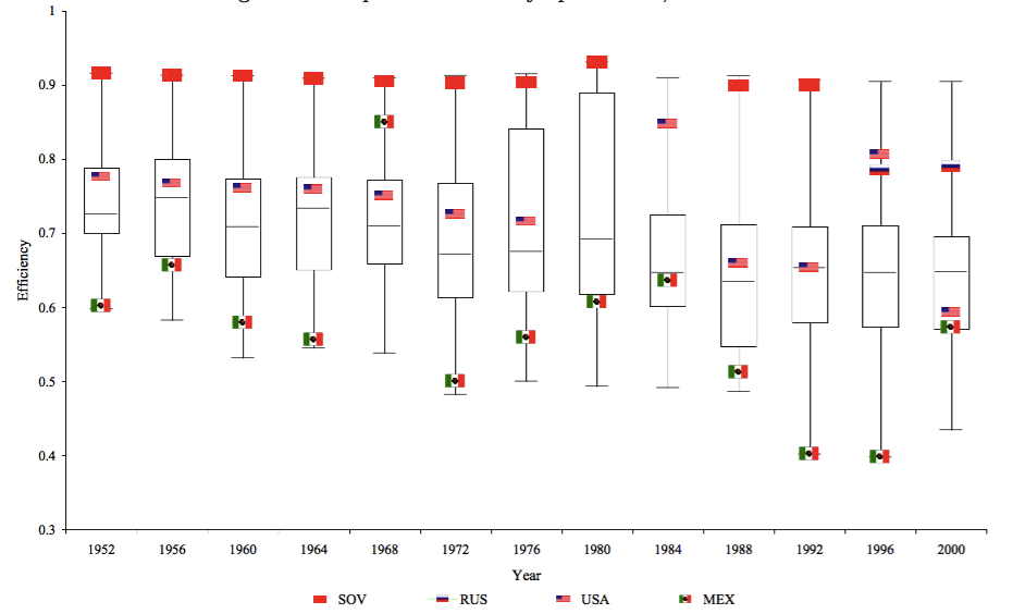
Figure 2.6: The production of Olympic Medals, 1952-2000, Rathke and Wotiek (2007)
Visualizations by Eirk (2016) for the Telegraph, and those by medalspercapita.com also highlighted the importance of GDP and the size of population. For example, Eirk (2016) ranked Olympic nations based on “Gold per million people” and “Gold per £100 bn GDP”. See Figure 2.7 and 2.8.
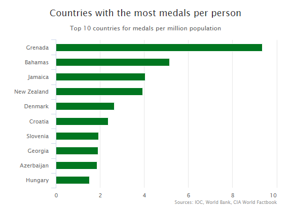
Figure 2.7: Top 10 countries for medals per million population, Eirk (2006)
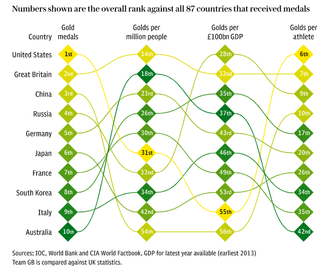
Figure 2.8: Ranking medal production considering population and GDP, Eirk (2006)
Similarly, using the concept of “medals per capita”, medalspercapita.com ranked countries based on “population per medal”, i.e., how many people are needed to generate a medal. They created a choropleth map based on the results where darker colors indicate lower “medals per capita”. See Table 3 and Figure 2.9.
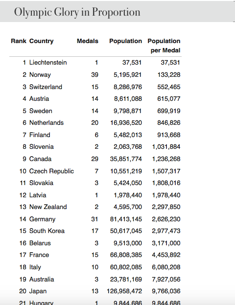
Table 3: Population per medal
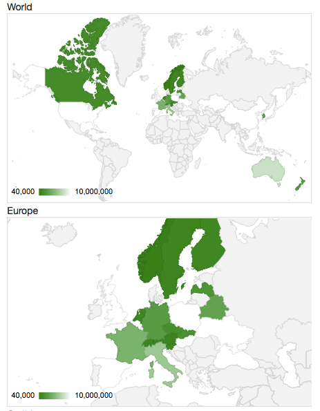
Figure 2.9: World map of population per medal
However, we think it is problematic to divide medal counts by population or GDP in measuring medal efficiency. First of all, this method is unfair for countries who joined the Olympics late. For example, China (PRC) attended the Olympics for the first time in 1952 and due to political issues, it was not a participant till 1984 (COC, 2004). If the total number of medals is the basis for medal efficiency, it would be unfair for countries like China and many newly founded countries in Africa.
Second, it might be unfair to divide the number of medals by population. This formula assumes that a country can send as many athletes as it wants, but this is not the case. For example, for Tokyo 2020, each country can send at most three male and three female athletes (International Table Tennis Federation, 2018). As a result, China will send six table tennis athletes, as will Australia, Japan, Brazil, Egypt, Germany, and the United States (Wikipedia, n.d.), even though China’s population size is larger than that of all the six countries combined (World Bank, 2018).
Third, it might be simplistic to only count the total number of medals. There has been a debate on whether the ranking of Olympic countries should be based on the number of total medals or only golds (Johnson, 2008). We decided to adopt the method by New York Times, i.e., “medal points” (Klein, 2008). In this system, a gold medal is given 4 points, silver 2 and bronze 1. Center for Strategic International Studies (n.d.) used this method and ranked countries based on what they called as “weighted medals”.
In this interactive, viewers can see a country’s ranking on each category of sport in a specific Olympic Games by clicking the country’s name. This visualization is clear and direct, but it has some drawbacks. First, only the top countries can be shown interactively but there are over 200 participating countries and regions. Second, and because of the first drawback, this visualization did not provide viewers a general idea of the distribution of media efficiency across countries. See Figure 2.10.
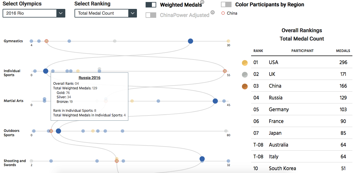
Figure 2.10: Ranking of countries by weighted medals
To solve these problems, we decided to rank countries by “medal points” as well, but on an interactive choropleth world map.